
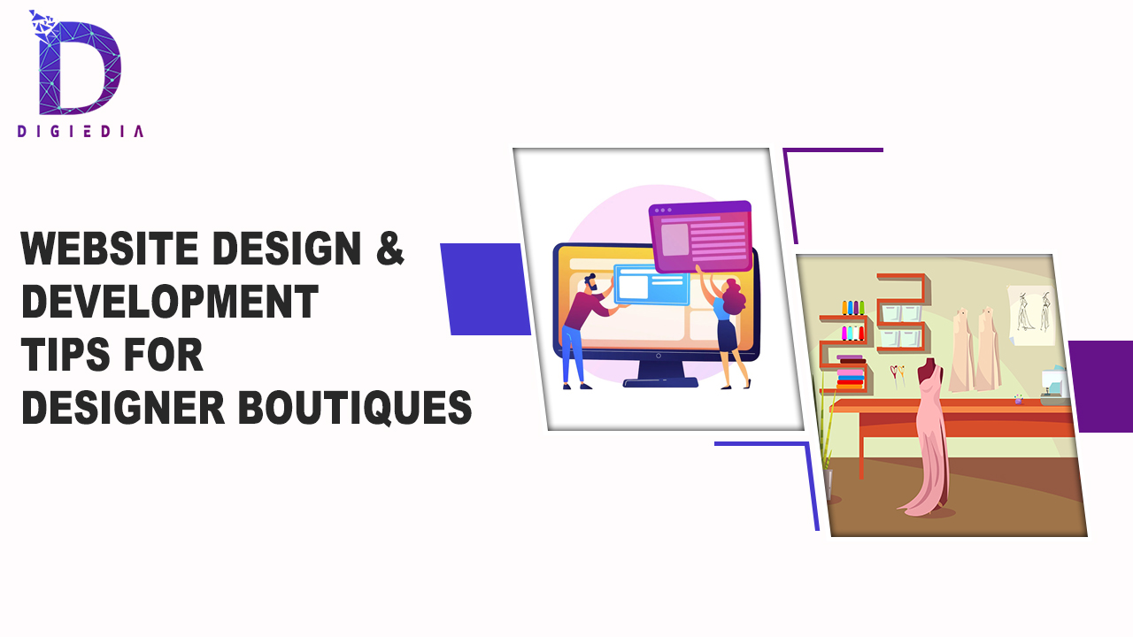
Website design and development tips for designer boutiques
- DIGIEDIA
- Blogs
- 29 June 2022
- No Comments
When it comes to design, your website can be anything from stylish to minimalistic, from vibrant and vibrant to sleek and futuristic.
While your ultimate look and feel should reflect your style, line of work, and company identification, there are some general guidelines to follow.
Great site design contributes to your user experience and functionality while remaining simple to comprehend at first glance. Five simple Website design tips for designer boutiques are mentioned below to assist you to make your site more successful and compelling:
-
Keep your homepage simple and clutter-free.
The core message of your website should be communicated right away on the homepage. We rarely read every word on a webpage, after all. Instead, we quickly scan the page, marking the most important words, sentences, and images. It’s best to appeal to emotions rather than word count with these established habits in mind.
The less your site visitors have to read, click on, or remember, the better they will be able to absorb and evaluate your information. Users are more likely to perform what you want them to do if you design for shorter attention spans and employ a current website design.
These simple website design tips for designer boutiques can help you divide up your content and create a presentable and inviting homepage design when learning how to design a website:
- Keep vital material above the fold: Visitors should be able to comprehend the purpose of your website without having to scroll or click anywhere.
- Your information should be spaced out: In between elements, use whitespace. You may make the design feel more spacious and well-balanced by leaving some places vacant. For your material, use small, understandable paragraphs.
- Include images: Alternative approaches to express your argument can include high-quality media assets such as gorgeous images, vector graphics, or icons.
- Place a call-to-action (CTA) button on your homepage to encourage site visitors to do the action you want them to take, whether it’s making a purchase or signing up.
-
Create a visual hierarchy in your design
Hierarchy is a website design tip for designer boutiques that aids in the presentation of content clearly and effectively. You’ll be able to direct site users’ attention to various page pieces in order of importance, starting with the most important piece, by using hierarchy correctly.
The main elements of the visual hierarchy are as follows:
- Make your most significant assets, such as your company’s name and emblem, larger and more noticeable by increasing their size and weight. Readers are drawn to large, bold titles first, then smaller paragraph text.
- Use the right website style to guide your visitors’ gaze. You can, for example, put an important call-to-action button in the exact centre of the screen or have your brand appear in the header.
Once you’ve established a clear hierarchy for your work, readers will naturally follow the breadcrumbs you’ve left for them. Then, for added emphasis, use colour, contrast, and spacing, keeping in mind what is attracting the most attention and ensuring that it is always purposeful.
Strips or grid layouts, such as those found in the Wix Pro Gallery, are effective web design features for achieving a strong visual hierarchy. Check out our designer-made website templates for more ideas and inspiration.
-
Make website content that is easy to read.
People’s capacity to recognise words, sentences, and phrases is measured by “readability.” Users will be able to scan, or skim-read, through your site with ease if its readability is excellent. This method makes absorbing information much easier.
It’s not difficult to make a website readable; follow these simple guidelines:
- Contrast is essential: It’s crucial to have enough contrast between your text and background colours for readability and website accessibility. While the colour scheme of your website is likely to be similar to your brand colours, make sure there is enough contrast between your elements. Use an internet tool like Contrast Checker to do so.
- Smaller fonts are difficult to read for the majority of people. Keep your body text at least 16pt, according to standard web design guidelines. That’s a fantastic place to start but bear in mind that the exact quantity depends entirely on the fonts you use on your website.
- Font types: There are numerous font kinds available in the typographic field. You can choose between serif fonts (like Times New Roman), which feature small projecting lines on the ends of letters, and sans serif fonts, which mean “without serif.”
For long web documents, such as the one you’re reading now, sans serif fonts are the best option. Mixing these distinct types can also result in fascinating font pairings.
There are also many lovely display fonts available, such as handwritten script fonts. If you choose one of those, be careful not to overdo it to avoid an overwhelming effect. This is one of the website design tips for designer boutiques.
- Use no more than three different typefaces within a single website. Some projects may require more complex font combinations, but too many different types might appear cluttered and detract from your brand identity.
- Make use of text themes: To create a clear hierarchy, make sure your written website content is varied in size and weight, from a huge header to smaller subheadings to even smaller paragraphs or body text. This helpful website design tip helps ensure that visitors’ attention is always drawn to something interesting.
-
Make sure your website is simple to navigate.
Although it may be in your nature to disobey the rules, internet navigation is not the place to do so. After all, you want your users to be able to quickly discover the information they need. Furthermore, a site with good navigation makes it easier for search engines to index your information while also increasing the user experience:
- Link your logo to your homepage: This website design advice is a typical occurrence that your visitors will anticipate, saving them time and effort. Create your logo as part of your branding efforts if you don’t already have one.
- Pay attention to the menu: Your website menu should be prominent and easy to discover, whether you choose a conventional horizontal list, hamburger menu, or something else. Furthermore, make certain that it is organised according to the importance of each component.
- Use an anchor menu if your site is long-scrolling, such as a one-page website. Viewers will be able to swiftly jump to any section of the site with just one click. Another alternative is to use the ‘Back to Top’ button, which takes visitors to the top of the page regardless of where they are on your website.
- Work on your footer: Because your website’s footer is likely the last thing people view, it’s a good idea to put all of your crucial links there. This might include your contact information, social network icons, a condensed version of your menu, or any other pertinent connections that visitors might require.
-
Maintain a mobile-friendly environment
Another Website design tip for designer boutiques is that your professional website should be accessible to all visitors, regardless of device. Wix provides a mobile-friendly version of your website immediately when you create one, so you can stay up with the ever-changing world of mobile.
Examine your site’s mobile version from the perspective of a user, and test each page, user action, and button.
To make your mobile website cleaner and less cluttered than your desktop version, consider restricting page components and scaling down specific assets, such as the menu. You can also use special mobile features to improve your mobile design.